Insights: Retention and Turnover
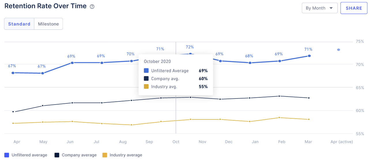
Turnover and Retention are top of mind as a leader. RETAIN equips you with this data via the Insights>Retention page. We have included a Standard Retention graph to help you understand the changing headcount of your workforce.
A look into Retention
According to SHRM, a respected thought leader in the Human Resources Management community, the formula for measuring retention is:
# of individual employees who remained employed for entire measurement period /
# of employees at start of measurement period) x 100
This formula does not take into account new employees who joined during the course of the measuring period, nor does it include departures that were involuntary in nature
How RETAIN measures retention:
Example - Suppose, that for a given month:
- There were 8 people at the beginning
- 2 of them left
- 2 joined to replace those who left
Your retention rate for the month: (6/8)*100% = 75% . It is thus based on those at the beginning who stayed through to the end of your measurement period.
By default, the grouping for months and quarters follow the calendar year.
Milestone Retention:
We do not include new hires in the headcount while measuring retention numbers across the firm. However, in order to measure retention and turnover specific to new hires only, we look at milestone based retention numbers. To access this, click on the ‘Milestone’ option in your Retention graph.
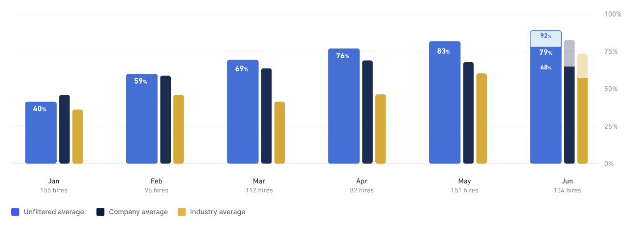
Formula:
# of new hires who remained employed during the measurement period / # of new hires hired at the start of the measurement period * 100
As an example, 7-day retention in February is asking “how many hires in February lasted at least 7 days?” And the same thing for the other time ranges.
Leading Indicators of Retention Rate
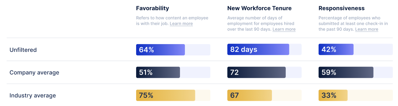
Favorability
Favorability is calculated by the average rating of check-in responses to “satisfaction” questions (i.e. “How would you rate your first week?”) from the last 3 months. This is unique per hire (i.e. if we’ve sent a hire a 7-day and 30-day check-in during this period, we’ll use the most recent response we’ve received from them).
New Workforce Tenure
The average tenure of hires from the last 90 days.
Responsiveness
Percentage of unique hires we’ve sent check-ins to in the last 3 months that have responded.
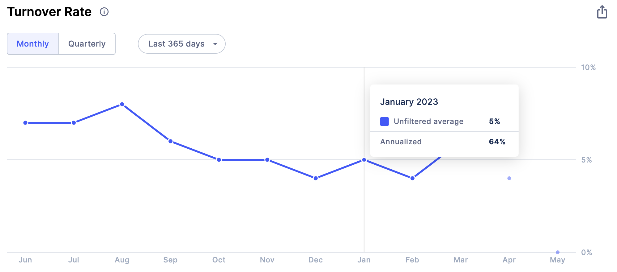
New! Accessing the turnover line graph
Similar to retention, you can access turnover via the Insights page> Retention. A new update to this page is the line graph for Turnover, allowing you to see the trends in Turnover over time by a monthly, quarterly and annualized basis.
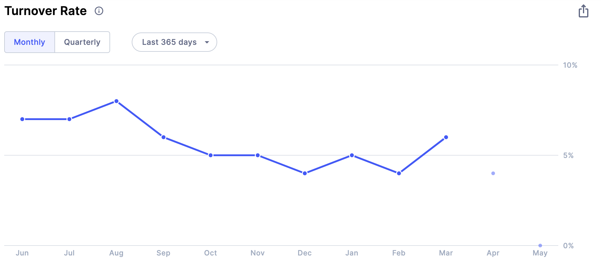
New! What is annualized turnover?
Annualized Turnover is a projected turnover rate. It’s an estimate of how many employees you could lose in the near future. For example, assume your monthly turnover is 5%, if you continue on this trend, your annualized turnover would be thus 5%*12, which is 60%. Similarly, if your quarterly turnover is 10%, your annualized turnover would be 10%*4 which is 40%, after all, if I lost 10% in the first quarter of the year, then I might expect to lose 40% for the whole year.
To access, simply hover over on data points on the Turnover line graph
I would like to switch to exclude certain terminations from turnover. How do I do that?
For Standard Turnover, we can accommodate specific reason codes or explanations that you would like to see excluded from the number of separations (the numerator in the formula). Your Turnover % could thus be lower than what it was before the exclusions.
If you would like to update your termination exclusions, contact your Customer Success Manager who will work with you on the next steps. There is no additional effort needed on your end other than clarifying what exclusions (if any) you would prefer.
What is YTD Turnover?
This shows you what is your latest turnover since the start of the calendar year till date.
Hiring and Turnover Breakdown
This data is calculated by taking all the hires from the selected time period and figuring out what their retention is.
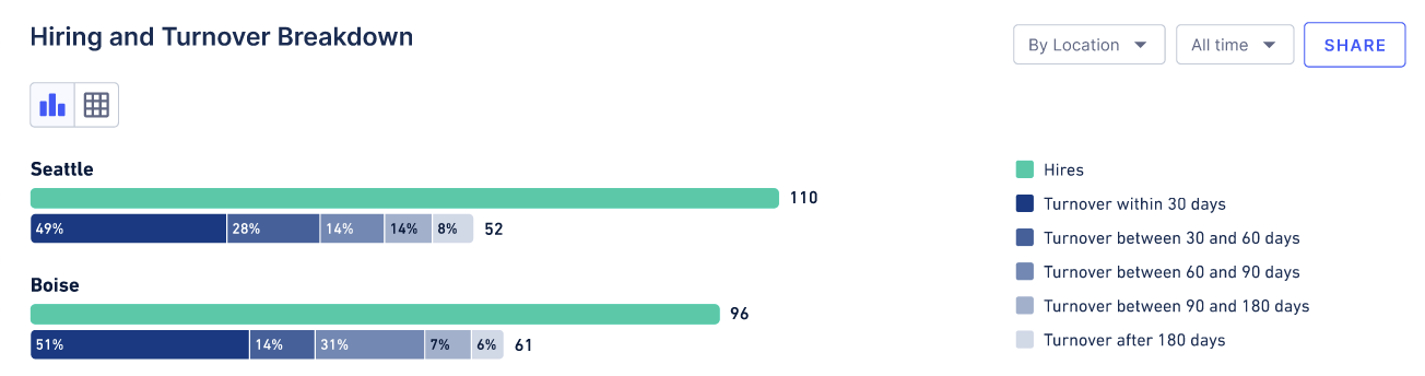
In the above graph, the teal bar indicates the total number of hires, and the blue bars underneath represent the terminations. The termination bars are color-graded based on when the term occurred (see the legend for exact specifics), and sized based on the percentage of the overall hires it accounts for.
For instance, if you had 50 total hires and 10 terminations in less than 30 days, the dark blue bar would be 20% of the size of the teal bar (10/50 = 20%).
These are currently sorted by the location or role type that has the most hires. Using the filters at the top of the page will allow the data to change based on what the new “top-level” filter becomes.
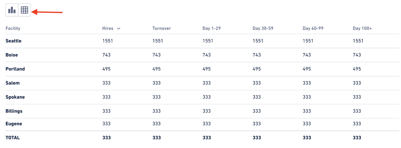
This table shows the data from the graphs in a tabular format.
Why are my Retention charts blank?
Retention takes a longer time to calculate than Favorability. If you have just started using WorkStep RETAIN it's possible that you don't have enough data to populate these charts for the selected time period. You can shorten your time period or talk to your WorkStep representative about importing historical termination data.
Open training sessions are available! Looking for some help getting started with WorkStep? In need of a refresher on best practices or feature functionality? Join us for one of our biweekly trainings by RSVPing here!